
One evening while giving my eyes a rest I decided a change from painting white uniforms was needed, what about those figures I had put aside, how could I avoid cleaning and repriming but keep the momentum going on the French? Seeing as how my French SYW/WAS army would contain a number of Infanterie Entrangere I decided to scout out a suitable regiment that would fit the cut of uniform and equipment, but where a darker primer might be used without giving the game away, happily the Regiment Irlandais de Lally Tollendal of the Wild Geese seemed like it might fit.

This is the darker primer grey I used which is pretty much a standard car primer grey, way too dark for the white grey of the French uniform and no where near the white undercoat I'm determined to make a success of, eventually. The figure was given a wash with Artist Acrylic black brown which differs from the panes grey the French infantry figures are washed with.
I'm painting quite a bit with washes or well thinned down paints and find a shading wash over the primer first seems to carry the shading effect through to completion of the job.

View from the rear, I had thought of giving the Irish greyish cloth packs hence the blue wash but stuck with the linen coloured cloth in the end. You will notice that when the next photos appear that the they don't have the facing colours, this is simply because the primer photos that fit with the figure below turned out pretty poor so I quickly took a few new photo's of one of the others lads waiting to be kitted out.

When it came to painting the coat it didn't take me long to realise that I was going to be rowing up 'that' creek without adequate means of propulsion in a prickly canoe. Just going over the undercoat with red paint or wash was not going to be viable, the undercoat was too dark and the approach would need a re-think, if you look closely at this feller you can just make out he has already received a thinned coat of red paint prior to the rethink. Similarly it didn't look like a highlight with white first would get a desirable out come either so falling back onto an idea which came about with a hard plastic roman figure I painted recently I decided highlight over the aborted red with an orange highlight and then paint the figure with thinned red wash and hope the whole lot blended together.

I only painted one half of the figure first of and used very thin wash (4 water : 1 ink maybe weaker) in case the whole idea turned to cack. Good news, as I started laying on the wash the effect I was looking for seemed to be coming together and I splashed an another coat (although this photo doesn't do the shade of red much justice), this is roughly about five (!) coats of thinned wash.
Eventually this would recieve another two coats of 1:1 wash which you will see later on (last three photo's) or the earlier post if you have been looking around. Feeling pretty confident I had a plan to work with I started on the other side of the miniature.


So here it is (shown above), working off my cunning plan I thinned down a coat of red paint which left the darker areas of the brown black wash over primer to suck in the light and provide the shade and picked out the highlight points and larger flat areas with the orange to reflect the light. Well time to splash on the red wash and see........


..........I think it worked out ok for something that was going to take a swim in dettol or acetone.
Quick note on the photographs, I had adjusted the camera aperture setting (going into manual territory ??? oh my gawd) and switched back to the 'chrome film' effect for these shots as this gave a very good representation of the shade of red under lower light conditions and this (link) is a pretty accurate representation of the colour and hue under higher (filtered sun) light conditions.
I'll wrap this little painting saga up tomorrow with paint brands and names for those that might be interested, but right now I think I might go and watch Mark Webber win the Hungarian F1 race AGAIN, strange I never get sick of watching Vettel being beaten by his team mate. ;-) Brrrrrrm....
oink oink!

This is the darker primer grey I used which is pretty much a standard car primer grey, way too dark for the white grey of the French uniform and no where near the white undercoat I'm determined to make a success of, eventually. The figure was given a wash with Artist Acrylic black brown which differs from the panes grey the French infantry figures are washed with.
I'm painting quite a bit with washes or well thinned down paints and find a shading wash over the primer first seems to carry the shading effect through to completion of the job.
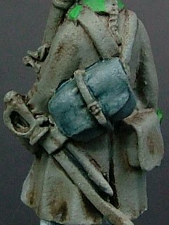
View from the rear, I had thought of giving the Irish greyish cloth packs hence the blue wash but stuck with the linen coloured cloth in the end. You will notice that when the next photos appear that the they don't have the facing colours, this is simply because the primer photos that fit with the figure below turned out pretty poor so I quickly took a few new photo's of one of the others lads waiting to be kitted out.

When it came to painting the coat it didn't take me long to realise that I was going to be rowing up 'that' creek without adequate means of propulsion in a prickly canoe. Just going over the undercoat with red paint or wash was not going to be viable, the undercoat was too dark and the approach would need a re-think, if you look closely at this feller you can just make out he has already received a thinned coat of red paint prior to the rethink. Similarly it didn't look like a highlight with white first would get a desirable out come either so falling back onto an idea which came about with a hard plastic roman figure I painted recently I decided highlight over the aborted red with an orange highlight and then paint the figure with thinned red wash and hope the whole lot blended together.

I only painted one half of the figure first of and used very thin wash (4 water : 1 ink maybe weaker) in case the whole idea turned to cack. Good news, as I started laying on the wash the effect I was looking for seemed to be coming together and I splashed an another coat (although this photo doesn't do the shade of red much justice), this is roughly about five (!) coats of thinned wash.
Eventually this would recieve another two coats of 1:1 wash which you will see later on (last three photo's) or the earlier post if you have been looking around. Feeling pretty confident I had a plan to work with I started on the other side of the miniature.


So here it is (shown above), working off my cunning plan I thinned down a coat of red paint which left the darker areas of the brown black wash over primer to suck in the light and provide the shade and picked out the highlight points and larger flat areas with the orange to reflect the light. Well time to splash on the red wash and see........


..........I think it worked out ok for something that was going to take a swim in dettol or acetone.
Quick note on the photographs, I had adjusted the camera aperture setting (going into manual territory ??? oh my gawd) and switched back to the 'chrome film' effect for these shots as this gave a very good representation of the shade of red under lower light conditions and this (link) is a pretty accurate representation of the colour and hue under higher (filtered sun) light conditions.
I'll wrap this little painting saga up tomorrow with paint brands and names for those that might be interested, but right now I think I might go and watch Mark Webber win the Hungarian F1 race AGAIN, strange I never get sick of watching Vettel being beaten by his team mate. ;-) Brrrrrrm....
oink oink!
Thats a really nice trick with the red, paintpig. Which inks do you use? 'Standard inks' or those new GW washes a lot of people are using?
ReplyDeleteThanks
Adam
Hello Adam
ReplyDeleteIm pretty simple (I heard that) as far as paints go the wash is standard citadel red wash. Im sure vallejo and GW have a bog standard red, although no doubt it has a way cooler name!
I've given some thought to your von Gruel ;-) regiment and Im sure you could use this, you need to find or concoct a wash and suitable base colour that can produce a powder/cornflower blue. Im sure there is a combination that would produce the right effect, just needs a bit of experimenting. The green would be pretty easy though.
regards
pp
Congratulations on a very interesting and informative post.
ReplyDeleteI know that I'll be playing with 'other' basecoats over the next couple of months.
Tony
http://dampfpanzerwagon.blogspot.com/